Last week, when suggesting you consider a logo makeover, I mentioned that there are a few qualities of logo design that most people tend to agree on. Those are …

• Keep it simple.
• Make sure it’s legible.
• Strip away all the color to ensure that it still
stands up in just black and white.
• Aim for an image that’s memorable.
• Be unique; try, as best you can, to stand apart from your competitors.
Of course, if these five tips don’t give you a whole lot of specific direction that’s because it’s difficult to put into words something that you react to on an emotional level. Part of the problem is that there’s no common language for businesses and their graphic designers to discuss visual aesthetics. There are tools, though, that can help you start a meaningful dialogue.
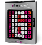
When starting to re-think your imagery, the first thing you should do is  look at a lot of really well-done logos. There’s a great series of books called Logo Lounge (by Bill Gardner and Catharine Fishel) that are filled with award-winning logo designs. These serve as an excellent starting point. Flip through the pages and find logos that you speak to you—whether they “work” for your particular business or not—and make a few notes about why they’re appealing (i.e., “swirly and feminine” or “aggressive and bold” or “cute and quirky”). Continue your research online, carefully considering the logos of others within your industry in order to differentiate your brand and avoid substantial similarity (that’s code for trademark infringement).
Rather than trying to explain what you want a logo to look like, which can be very difficult to put into words, it’s easier and more fruitful to give someone a concrete example of what you’re attracted to. When you’re able to show a designer what you like, the process will become a lot easier. “Oh!” the designer will exclaim, upon noticing a pattern you may not have recognized. “He really likes [classic looks], [animal icons], [edgy designs], etc.” Consider marks, fonts, and layout to give favorite examples in each category.

Of course, your logo doesn’t necessarily have to utilize a symbol. Sometimes, the right logo is simply a special font or a basic shape; however, illustrative design is a great way to stand out and be unique.
 If you decide to go with an icon logo, focus on finding the right symbolism. Don’t choose an image that doesn’t relate to your trade (i.e., a bicycle for a dry cleaner). Communicate in a clear way what it is that you do.
Ask your designer for three to five distinct options. These should be drastically different, unique options, as opposed to variations on the same design. By having choices that are varied, you’ll be able to see clearly what style(s) you’re attracted to. Not only is it okay to have sharp feelings about these looks, it’s encouraged. Saying, “I really hate this one because it’s too frilly,” can actually help your designer.
 The fact is: your reaction to a logo should be a visceral response. You need to have a positive feeling, on a gut level, that the logo you choose represents your business well. At the end of the day, that is more important than a trendy color or up-to-the-minute design.
Simple or complex, austere or ornate, monochrome or rainbow, there simply isn’t one “best” way to design a logo anymore. It used to be a basic tenet of design that a logo needed to look good in newsprint or in a very small format. Often, that ruled out illustrations or detailed pictures. Luckily, the old rules are rarely applicable anymore.

Your logo should shine best on whatever medium it’s on the most. If you’re online-based, you can use a lot of colors and be more complex; it doesn’t much matter how your logo reproduces on paper. If you do a lot of print advertising, however, you’re probably going to need to go with something simpler. Quantas Airlines, for instance, not only took into consideration how their new logo would appear on paper and online, but also how it would look plastered across the tail of all of their aircraft, as well.
Whatever you choose, run your new logo by several people not associated with your business to judge its appropriateness. There may be an unintended meaning that you don’t catch (ahem).
Have you seen any great logos lately? Whose are they … and what’s so great about them?


