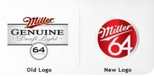
 It may seem like a pain to change your letterhead or signage, but whether you’ve been around for five years or fifty, your logo may very well be in need of an update. Although you may not have thought about it recently, it’s altogether possible that your logo is outdated, has become cliché, or uses a font that speaks to an earlier decade.
It’s important to recognize that most logos can never be truly “timeless.” Just as there are trends in fashion, there are trends in design, as well. So, don’t be afraid to give your image a modern logo makeover.

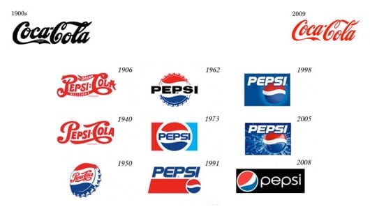
Even a brand like Coca-Cola, which has never updated its logo, uses continually fresh design elements and new packaging around a consistent mark. Its competitor, Pepsi, however, redoes its logo every decade or so.
Thus, you don’t necessarily need to create an entirely new logo, but you may want to freshen it up. An updated logo can do pretty incredible things, like energize your employees, excite your existing clients, and capture the attention of brand new customers.
You may be asking yourself, “Do I already have a good logo?” Well, if you Google “What makes a good logo?” you’ll get over a million results. Obviously, there’s no one right answer to the question. There are, however, some qualities of logo design that most people tend to agree on.

• Keep it simple.
• Make sure it’s legible.
• Strip away all the color to ensure that it still stands up in just black and white.
• Aim for an image that’s memorable.
• Be unique; try, as best you can, to stand apart from your competitors.
Tell me which companies you think have the best logos. Do those logos fit these criteria?


