This week’s guest post is brought to you by Mark Chapman, owner of Everett Andrew Marketing. Mark develops effective pay-per-click campaigns that cut through the clutter and turn prospects into paying customers. And then he blogs about it.
*****
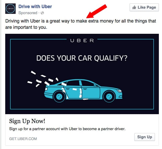
Lately, my newsfeed has been flooded with Facebook ads encouraging me to sign up and be an Über driver. While I don’t have any plans to do so, I’ve truly enjoyed analyzing their marketing messages. Read on to discover what Über got both right and wrong with the ad campaign – there are a lot of great takeaways to help you understand what goes into effective Facebook Ads!
Got It RIGHT: Ad Copy
They totally nailed it! It’s short and simple, offering a value proposition which anyone can relate to: earning extra money. Plus, it is not written in the first person using “we” and “our” – rather they’ve put the ball in our court by using “you.”
Takeaways for your own effective Facebook Ads: keep your Facebook ad copy short, simple and clear with one single value proposition. Don’t use first person language – use “you” and “your” instead.
Got It RIGHT: Ad Imagery
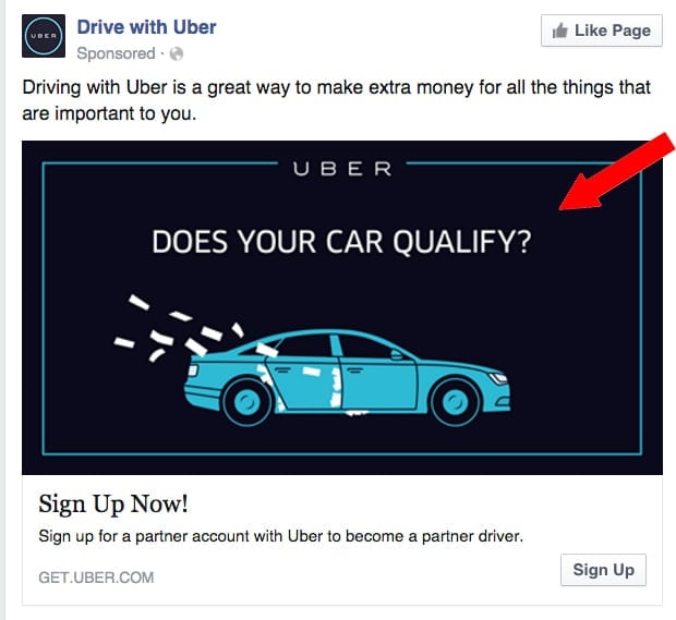 (This is what first caught my eye and made me say “Wow!”) It’s so hard to find imagery that is clean and simple, yet fully supportive of the ad’s message. The imagery in this Über ad is so good you barely even see the ad copy above it, and your eyes are immediately drawn to the question posed in the image.
Takeaways for your own effective Facebook Ads: It’s ok to have text in your ad imagery as long as it is limited to a few words. The image should always support and enhance the message you’re trying to convey. The image should be simple and clean.
Got it WRONG: Call-To-Action (CTA)
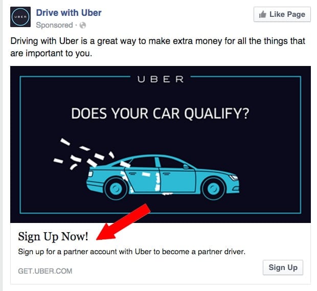
The powerful question posed in the ad’s imagery immediately makes you wonder if your car is good enough. Who doesn’t want to know, right?! In the image, Über is asking you to find out if your car qualifies, but the official CTA in the button below is asking you to ‘sign up’.
“Hold on a sec Über , I just want to know if my car qualifies. …How can I be ready to sign up and be an actual Über driver when I don’t yet know if my car qualifies?”
The corresponding call-to-action with this ad should read something more like “Find Out Now!” or something similar.
Takeaways for your own effective Facebook Ads: Don’t ask people to do two things in the same ad – limit your ad to one CTA. If you have a second CTA you’d like to try (i.e. signing up to be a driver is the second CTA for Über ), create a second ad with copy and imagery that matches it.
Got it WRONG: Message Match & Landing Page
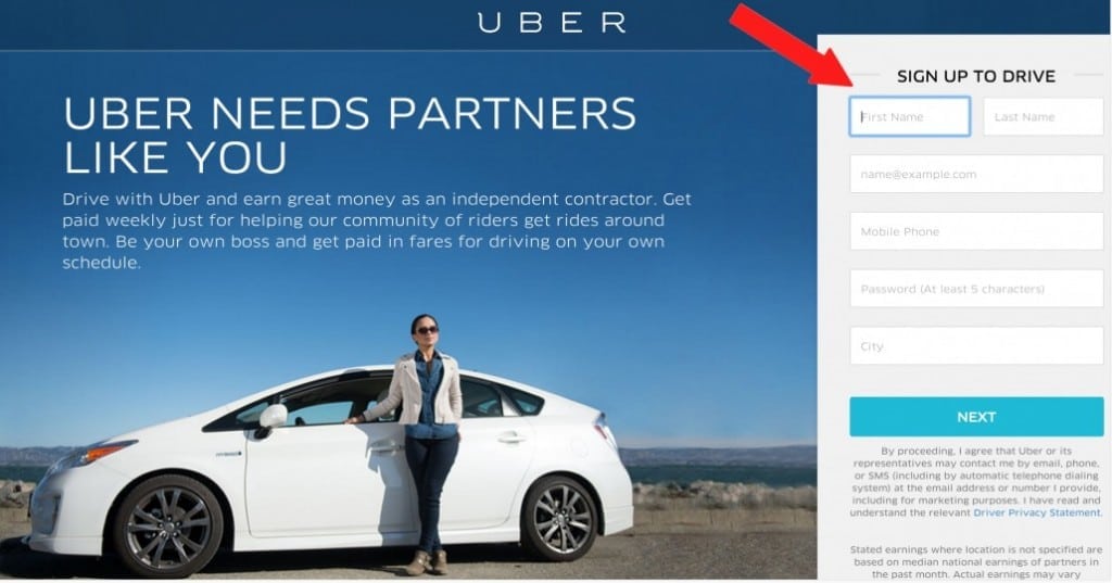 When you click on the button in the ad it’s natural to think you’d hit a landing page on Über ’s website which asks you about your car and tells you if it qualifies. Unfortunately, the landing page for this ad carries the same mistake as the CTA above and asks you to sign up to be an Über driver.
“But wait… what about finding out if my car is good enough? I’m confused.”
The message of the ad and the landing page don’t match, and there’s no way to find out if your car qualifies after you click. The landing page has a different CTA. Here, you have to give over quite a bit of personal information and commit to signing up before you can proceed. This is likely to cause people to bounce off the landing page and not convert.
Imagine how many more leads this page could gather if Über asked only for your email address and car’s details! Then, they could follow up with a direct email message encouraging you to sign up if your car qualifies.
Takeaways for your own effective Facebook Ads: The message in your ad must match the message and CTA of your landing page. Never surprise people with unexpected information, or ask them to do something on the landing page that is different than what you’re asking of them in the ad.
Overall, Über did some great things in this campaign and probably generated a lot of interest! As outsiders we don’t know the conversion results, but it’s likely their conversion rate wasn’t as good as it could have been. Their conversion rate optimization team is probably already on to better and more effective ads, but I’m definitely glad they ran this one for a while so we could have a perfect example for analysis and creation of takeaways to help you create more effective Facebook Ads for your own business!
*****
 Mark Chapman is the owner of Everett Andrew Marketing. Mark’s continual work in pay-per-click marketing, landing page development, and conversion rate optimization give him endless amounts of insight for teaching, writing, and speaking about successful online marketing strategy.
