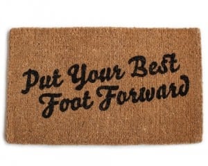
 When it comes to putting your best marketing foot forward, taking the first step can be a tad overwhelming. Where’s the best place to start, when both resources and time are scarce? The answer: your website. Specifically, your website’s content.
Whether you’re being found by new customers on Yelp, Google, or by word of mouth, chances are, people are checking out your home base before doing business with you. And if you’re like most small business owners, your website probably got the short end of the stick when you were scrambling to get up and running.
 So, take a moment now to solidify your home base. It doesn’t have to be perfect, but it does have to be persuasive. What makes someone new want to do business with you? It’s important to put out content that captures attention, creates legitimacy, promotes understanding, and boldly states your unique difference.
For most small businesses, a “brochureware” site will work just fine. What that means is that all of the content you’d have in a corporate brochure, you’ll simply translate to a web format. That includes copy for the following pages:
- Home / About Us
- Why Choose Us
- Services and Offerings
- Testimonials and Reviews
- Staff Bios
- Photo Gallery
- Frequently Asked Questions
- Contact Us
Start by writing out everything you can for each of these categories. Don’t worry about editing the first time around. Instead, attempt to tell someone everything they could possibly want to know about your business. You’ll also want to start gathering assets, including: logos, photos, videos, drawings, testimonials, user reviews, and so on.
The more concrete “evidence” you’re able to provide about your professionalism and trustworthiness, the more likely someone will want to do business with you. Think about it: Would you choose the legitimate business with real photos of an office building and staff members…or the fly-by-night website with cheesy stock photography? The shop with a physical street address listed…or just an anonymous feedback form?
The good news is that the process itself of starting with your website will force you to get organized and be more clear about answering “why choose you.”
Don’t forget to look at your competition and what they say about themselves. How are you different? Pay attention to the keywords they use, as well.
For most people, the biggest barrier to a finished site is the content. However, if it’s design chops that are holding you back, just think about what your one-page website would look like. What is the essential information? Then, go from that point. What does the next phase look like? What else might you add later on?
 Don’t try to make it more complicated than it needs to be. Consider an easy do-it-yourself solution (like wix.com), go for a WordPress template (on a site like ThemeForest.net), or hire a project-rate designer (on a site like behance.net). Regardless of which route you take, be aware that the bulk of the work will be yours. So, start gathering those assets and jotting down that copy!


