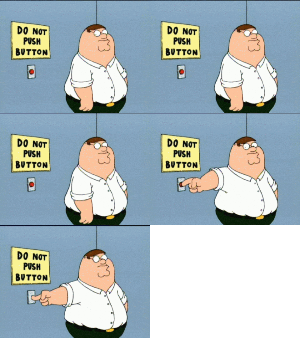
 A “call to action” (CTA) is a clear statement that steers users to a specific goal. It is the word or phrase that tells a reader, unequivocally, what you want them to do next.
A recent study found that web pages with a powerful CTA “converted” 72% of browsers to the desired goal. Conversely, pages without key trigger words only got readers to the goal 6% of the time.
Call To Action
Many CTAs are in the form of a clickable link or button that says something along the lines of:
- Buy Now
- Add to Cart
- Chat with an Agent
- Register Today
- Get a FREE Trial
- Contact Us Right Away
- Watch the Video
- Find Out More
- RSVP Instantly
- Click to Subscribe
- Claim Your Listing
- Start Here
Of course a powerful, commanding button–in and of itself–isn’t likely to get a user to take a desired action. He or she must be lead to that point with persuasive copy. It’s really a series of “micro-conversions.”
Only 20% of browsers make it through the headline of an article without looking for the “Back” button. Thus, the headline must create curiosity, the first sentence has to capture interest, the body needs to explain and persuade, and so on. Step-by-step, carefully crafted copy gets a reader to the desired action.
Creating snappy headlines is an art, to be sure. Just remember Newton’s first law of motion, and keep your readers “active” (wanting more) until that final CTA is delivered.
Get more actionable tips today! Buy Sell Local. Think Global. on Amazon. (See how I did that?) 🙂


