Presenting people with a strong call to action is a cornerstone of online marketing and sales. In early 2014, Facebook sought to simplify this process for its users by creating a set of ready-made “call to action” buttons. Users simply select one of the given options, and — Bam! — a self-explanatory button shows up right into their paid or organic Facebook posts, conveniently telling readers exactly what you want them to do. Facebook’s button choices include:

- Shop Now
- Learn More
- Sign Up
- Book Now
- Download
I have written in the past about the importance of testing, which is possibly even more true for …
… small businesses with limited financial and human resources. And though the idea of testing and gathering analytics might seem daunting, it can often be accomplished through very simple, very small actions – like testing whether adding a “Shop Now” button to a Facebook post actually gets people to, you know, shop more.
Heyo Bites the Button
This is precisely the test that Heyo, a company that provides a platform for businesses to maximize their Facebook marketing, sought to do — to see if these call-to-action buttons worked for in their own marketing. Such buttons ostensibly create a simple, clear, easily clickable instruction that your audience can follow through on.

Given that scads of research shows a strong call to action increases conversion, it makes theoretical sense that adding a button should increase conversion. But something working in theory and something working in reality are often two very, very different matters. And in a post by Heyo’s Brooks Tiffany, he noted that some initial testing runs, particularly one on InsideFacebook.com, indicated that use of a call to action button had an inhibiting effect, reducing the number of clickthroughs compared to the exact same ad without a button. Just as Alice found out in Wonderland, sometimes even the most straightforward seeming commands can produce unexpected and unintended outcomes. Goodness!

As for InsideFacebook, what the heck, right? They speculated that, for them, the button may have been too obvious a sell, alienating customers instead of enticing them. Many Facebook users perceive certain ad posts as updates or strictly informational and may click through from real interest. But a front-and-center call-to-action button may turn them off like a cheap hooker – not intriguing or subtle, but too overt and out-for-a-buck. Kind of like Christina Aguilera’s Moulin Rouge persona from way back when. (I sense you backing away from your computer screen even now.)
The Simple Power of the Split Test
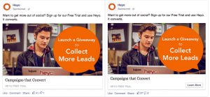
With all of this in mind, Heyo put into action the maxim that the only way to find out if something works for you is to try it out and observe the results. To do this, Heyo employed a split test, putting two ads head to head: one without any button (left), and one with a button urging viewers to “Learn More” (right). Heyo ran the test for a week, targeted at the same audience.

And lo and behold – the button worked for Heyo. In fact, it worked really well. The post with no button received 96 clickthroughs for a 28,000+ reach. The post with the button garnered 136 clickthroughs for a more modest reach of 24,682. That makes the costs per click far more attractive as well. No button = $1.22 per click. Button = $.86 per click, more than 40 cents less.
I’m guessing that unless you have a trust fund and a pretend business to mollify Mother and Daddy, or are using your small business as a money laundering operation for the mafia, that you want to save beaucoup bucks on your marketing efforts. All that for a simple little experiment, tracked through the mysterious magic of computerized analytics.
So Use the Button? Or Don’t?
As you can see, the button worked for some, and not for others. Great. So how does that clarify whether or not to use the button? It doesn’t. And that’s fine, since this post in not meant to advocate for or against your ultimate use of Facebook’s call-to-action buttons. It’s to show how easy it can be to test some business decisions, especially those on your website.
As great as a tool may sound – or conversely, in some instances where you might hesitate to use a tool because it doesn’t seem like a perfect fit – the only real way to decide whether it works for your business is to put it into action in a systematic manner and see the actual effect it produces. I have my own tips on how to test your website. But I’m keen to hear how you incorporate testing into your small business? Have any of your testing efforts yielded unexpected results? Please share!
Testing and analytics are so important to small business success, they occupy an entire chapter of my upcoming book, Think Global, Sell Local: 50 Innovative Way to Make a Chunk of Change and Grow Your Business, which will be released in November 2014 but is available for preorder right now!


