 Website testing can seem like pretty scary stuff. Don’t let the mathematics and graphics get you into a tizzy, though. The basics are really easy and the tools available today make the process quite manageable.
The main reason that website testing is viewed as challenging is that people have a very difficult time defining what they’re testing, exactly.
True success in testing occurs when you…
…tie the reason for your tests directly to your bottom line.

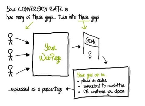
Often, that means measuring “conversion,” which is…
* a specific goal (i.e. entering credit card information)…
* tied to some part of the process
(e.g. the shopping cart checkout)…
* that contributes to your bottom line (i.e. final sales).
To simplify, a “conversion rate” compares the number of visitors that came to your site versus the number that complete your desired action.
Number of Visitors Completing Desired Action / Visitors, (x 100)=Conversion Rate As %

G.H. Brooks, on blogs.keynote.com, says: “Keep in mind that the average retail site has a conversion rate of 1-2%. A successful retail site has a conversion rate of 7-9%. A good ‘lead generation’ website (one where success is defined as a lead being generated for a sale, or a subscription) converts somewhere around 16-18%, the average site 5-6%.
“Taking all of this into account, and the ability to increase conversion rates by even one percentage point is massive. Given a scenario where you have 10,000 different visitors a month and with a 1% conversion rate (100 sales), if the average sale is $90, a boost to 2% means an extra $108,000 a year in revenue.”
That said, try not to think of your conversion rate as a specific goal number, but rather as an indicator of progress over time.
You simply need to know what your desired result is (i.e. selling more widgets) and then reverse engineer what the process is for the user getting to the desired result.
So, tell me: What is your "desired result" at the moment?


