 Believe it or not, on Facebook, the playing field is equal, in terms of branding. No matter what a company’s size or scope, it must employ well-designed graphics, high-resolution images, and clear messaging.
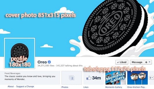
You may not have the branding power of Dr. Pepper, Oreo, or Old Spice…but you can compete on that level. A “brand” is really just a promise to consumers. You simply have to be able to tell a story really quickly about what your product or service is all about, and then deliver on that promise.
- What promise are you making to consumers?
- Is that communicated through original graphics?
- Is your copywriting targeted and engaging?
- Is what you’re putting out there a fun distraction and/or stress reliever for readers?
There are a few “rules of engagement” when it comes to the social sphere. So, who’s doing it right—and wrong? There are important lessons to be learned from both the best and the worst…
Insurance
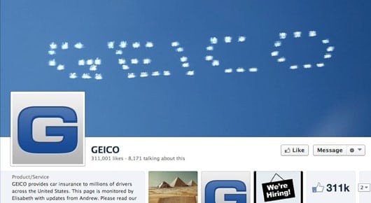
Company: Geico
About: “GEICO provides car insurance to millions of drivers across the United States. This page is monitored by Elisabeth with updates from Andrew. Please read our full description for terms. Not monitored 24/7.”
- Boring, unoriginal, monotone cover image (Where are the cars?)
- Lack of branding (What’s the UVP here?)
- Lack of personality (Where’s the gecko?)
- Lack of oversight (They’re doing national TV advertising but they can’t monitor their Facebook page regularly?)
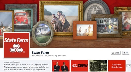
Company: State Farm
About: “At State Farm, you’re more than just a policy number. That’s why our agents go out of their way to help you ‘get to a better State®’ at every stage of your life.”
- Colorful cover image that corresponds with the logo
- Strong branding, both in tone and style
- A family feeling and sense of community
- Have a “Customer Help Center” as one of their main tabs
Personal Care
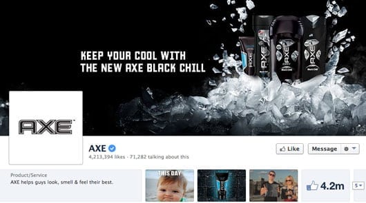
Company: Axe
About: “AXE helps guys look, smell & feel their best.”
- Cover image doesn’t explain what the product is used for (Is this a mouthwash or a mentholated back rub?)
- Monotone background and monotone logo (Is black the new black?)
- No brand promise (Where are all the hot girls?)
- Lack of stylized tabs (Is this a personal page or a company?)
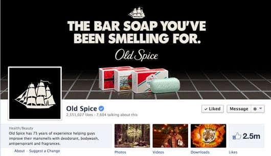
Company: Old Spice
About: “Old Spice has 75 years of experience helping guys improve their mansmells with deodorant, bodywash, antiperspirant and fragrances.”
- Product-driven cover image
- Strong, on-brand messaging with cool copy
- Clear, high-resolution images
- Fun, engaging “mascot”
Retail
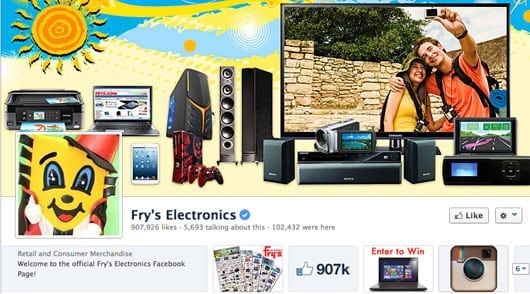
Company: Fry’s Electronics
About: “Welcome to the official Fry’s Electronics Facebook Page!”
- Cover image is cluttered, messy, and small (What IS all of this stuff?)
- Ugly, creepy mascot (Is this piece of cheese in a top hat the one that I’m supposed to be listening to?)
- Lack of what the brand is all about (To be fair, it IS actually representative of their brand: a bunch of disorganized stuff.)
- Lack of UVP (What do they want to be known for?)
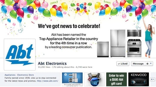
Company: Abt Electronics
About: “Family owned since 1936. Like us to stay connected for the latest news and promos. http://www.abt.com/”
- Fun, colorful cover photo that implies a celebration
- Incentivized marketing
- Implies reliability and establishment
- Clearly states that they’re the “top appliance retailer in the country”
Food
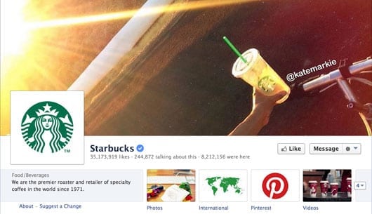
Company: Starbucks
About: “We are the premier roaster and retailer of specialty coffee in the world since 1971.”
- Grainy photo (Is that a user-generated photo? Who’s @katemarkie? Is that a Twitter handle?)
- No clear brand proposition (I don’t “get” it.)
- Unbranded app tabs (Why not utilize the look and colors of the brand?)
- No featured information or promotions (What am I supposed to DO here?)
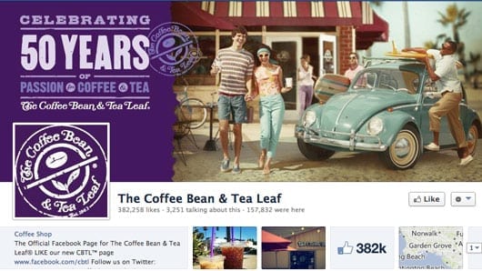
Company: The Coffee Bean & Tea Leaf
About: “The Official Facebook Page for The Coffee Bean & Tea Leaf® LIKE our new CBTL™ page www.facebook.com/cbtlFollow us on Twitter: www.twitter.com/thecoffeebean”
- Colorful, summer fun, seasonal cover photo that matches the profile image (logo)
- Clear sense of what the brand is and what it offers
- Outlines passion and longevity
- Graphics are developed specifically for Fackbook specs
Hotels
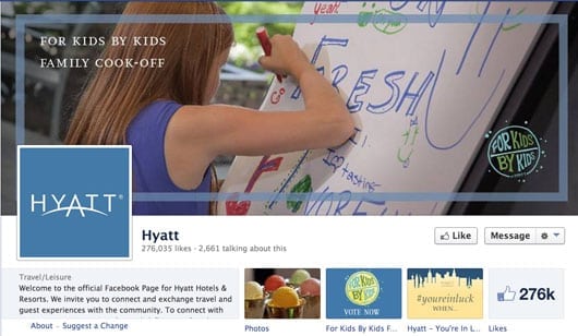
Company: Hyatt
About: “Welcome to the official Facebook Page for Hyatt Hotels & Resorts. We invite you to connect and exchange travel and guest experiences with the community. To connect with our…”
- Confusing, low-res photo (Why are we looking at a girl’s arm instead of her face? What is she even doing?)
- Unclear messaging (For kids by kids, family cook off? Is this a summer camp or a cooking competition?)
- Too wordy About section that gets cut off (What are we connecting with?)
- No photos of the hotel (Is this brand a budget hotel, a family hotel, or an extended stay hotel?)
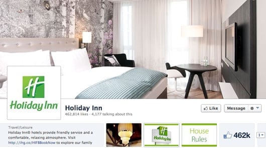
Company: Holiday Inn
About: “Holiday Inn® hotels provide friendly service and a comfortable, relaxing atmosphere. Visit http://ihg.co/HIFBBookNow to explore our family hotels.”
- Inviting photo of a hotel room that redefines my image of what a budget hotel looks like
- Branded tabs, with color consistency, that match the logo
- Inviting About section with key words
- Comprehensive photos of the properties
This final pairing is an excellent example of the importance of branding on Facebook. If all you had to go on was Facebook, would you rather stay at the Hyatt or the Holiday Inn? It defies expectations.
Facebook isn’t just a social networking site anymore. It’s just as important as your website, if not more so. Well-branded, clear, visually appealing pages draw in new customers and encourage interaction with fans.
Can you do better than some of these lackluster pages? I think you can!
*** The Chunk Of Change "Facebook Cover Contest" has a winner!!! Congratulations to Deborah Brown, who has secured a full UVP session, a custom-designed Facebook cover photo, and new profile pic (all valued at $1000). Keep an eye out for her new-and-improved page, coming late-September, 2013. ***
So, I’m curious…What have you done lately with your Facebook page to step up your game? What do you plan to do now?
