 In the world of e-commerce, a “conversion” is merely a sale made. It usually comes down to a “buy” button that’s clicked or a checkout process that’s completed.
Businesses with e-commerce sites want to track a visitor’s behavior from the time that they enter the site the final money being exchanged. “I’ve converted a visitor into a buyer!” they cheer…and go on their merry way.
Much of the web is focused on that definition of “conversion.” In reality, though, there are different types of conversion for different types of websites…and even for different points in a company’s or product’s life cycle. That conversion may be…
1.) Time-on-site
2.) Lead generation / email gathering / adding to a database
3.) The completion of a purchase
Thus, every website should have a conversion mentality—and a sincere focus on measurement—because every website has a conversion, whether they realize it or not. The art in this is creatively defining conversion points for your website or business that fall outside of a purchase.
I would argue that, in general, the best conversion is one that focuses on time-on-site as a metric. Of course, it’s not good if users are spending a bunch of time on your site because they’re looking for something they can’t find. But, beyond that, I don’t know of any website that wouldn’t be helped by a more active or more engaged visitor.
The longer someone is on your site, the more likely you are to get the visitor to learn more about your company, increase their brand awareness, and create brand loyalty.
 I am no exception. This blog’s number one conversion is time-on-site. If my words appeal to you, and you’re interested in learning more, my hope is that you’ll visit multiple blog posts that, overall, increase your time spent on the site. Beyond that, I would love it if you added your email address to my database. That’s another conversion point. Finally, one day, I may sell a particular product that may be of interest to my readers and that purchase will also serve as a conversion.
Of course, you can’t have a discussion about conversion without a discussion of key performance indicators (KPIs). A KPI is, simply, a measurement tied to a business objective. A KPI is supposed to simplify the measurements on a website so that it’s easy to see if they meet objectives. Unfortunately, this is lacking in most websites. Businesses tend to look at anecdotal evidence or, in many cases, totally irrelevant data to make decisions.
When it comes to KPIs, the Los Angeles Times is going to have a much different objective than Zappos. The Times is selling online advertising (which is dependent on eyeballs on the page), whereas Zappos is selling product (which is dependent items in the shopping cart). To Zappos, the completion of a purchase is the biggest concern.
Time-on-site, however, is not irrelevant to Zappos. To that end, think about all of the retailers that now have blogs on their sites. It’s about keeping the user engaged—and buying product—and getting that visitor to come back again and again. (Of course, if a retailer doesn’t have a KPI linked to the time-on-site objective, it’s not much use. Visitors may find the blog incredibly boring and leave quickly.)
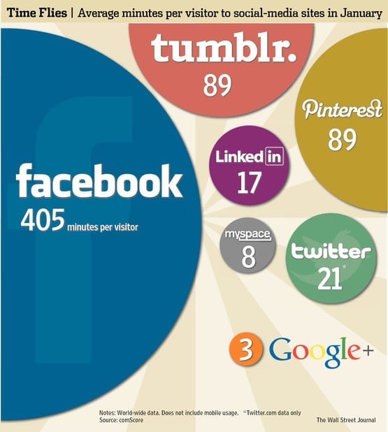
The ultimate examples of websites who value time-on-site are social networks. Like the Times, their goal is to extend your time on site…longer and longer and longer…in order to have better stats to attract bigger advertisers.
1.) Creating compelling lead-ins that encourage someone to further into the site
2.) Providing opportunities for engagement and interaction
3.) Offering helpful information
4.) Have interesting visuals (e.g. photos, videos, graphics)
5.) Write an engaging blog
6.) Allow users to comment and share
7.) Find ways to turn content into games
Don’t be surprised when your text-heavy, one-sided-conversation site—without a call to action—fails to keep visitors engaged.
You should design your site around the action you want the user to take—primarily, by making it friendly and easy. Caveat: If you give the user too much choice, it defeats the purpose.
So, take a cue from the best of them.
- If you’re showing products, show them up front, in an appealing way.
- If you’re hoping to tell someone about how a service is going to help them, initiate a chat function or make it easy for the person to sign up for your helpful newsletter.
- If you’re building brand awareness and providing information, create compelling content (or, even better, hire a writer to do it for you) and make people genuinely want to stay.
Once you start thinking in terms of conversions and KPIs, it will change the ways you design the pages on your site. Keep your eye on the prize, and make sure that they’re in line with your overall goals.
Now, go read 15 of my other blog posts, please.
