 A huge part of improving your website’s usability is making it simple for users to access the content they’re looking for right away.
By doing this, you’re saying to someone, “Hey, your time is really valuable, so I’m going to make it easy for you to get what you need on my website quickly.”
I’m not queen of the legos, but I do know that Lego clearly understands that the top three reasons someone may need their site has everything to do with…
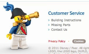
…those well-loved little plastic pieces that somehow find their way into couches and dog bowls everywhere. Namely, Lego knows that mom is likely to need one of three things: (1) order missing parts, (2) contact customer service, or (3) quickly download a set of the visual instructions necessary to complete steps 11 through 211 for her about-to-have-a-melt-down little builder.
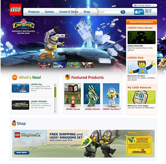
Lego’s homepage is remarkably simple, easy to navigate, and doesn’t insult its users’ intelligence by pushing irrelevant content their way. Lego obviously "gets" its main demographic (upper-income women between the ages of 35 and 45 that surf from home) and has already anticipated what those mommies are likely to be looking for.
In that vein, when working on your own website, be sure to give your users:
- Visual cues and simple paths in order to make a person’s experience almost thought-free.
- An easily accessible site map.
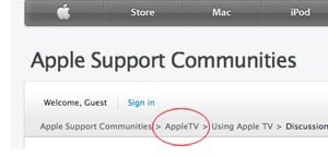
- Obvious “bread crumbs” (or perhaps a tiered system of menus, if you have a ton of content) so that users can easily navigate.

- Attractive enticements that offer a user something they didn’t already know about–being careful to avoid the hard sell.


