 You know you can’t be all things to all people and you can’t have one big button that users can push to get their desired result.
Even so, you have to know what you want your visitors to do, and how to give it to them—efficiently, effectively, and easily.
It’s important to be a little bit bossy in this regard. You have to create a strong call to action. Be clear about what particular thing you want users to do once they come to your site and then…
…Make sure that you’re guiding visitors in the right direction. Start by:
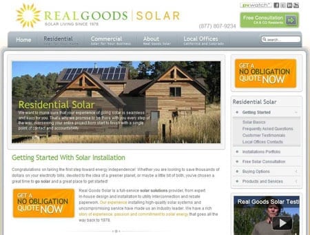
- Determining your points of interaction (i.e. a search box for an informational site, a checkout button for an e-commerce site, etc.) and making sure that those points are easy to access.
- Making buttons large and legible.
- Clearly indicating that buttons are meant to be clicked. (There are great button tests you can review at the excellent which test won.)
- Removing any distractions or extraneous information when you’re leading a user into a check-out, registration, or download process.
It’s OK to be the boss, just not this one:

