 DON’T!
Put up an “Under Construction” page on your URL.
DO!
Put up at least one page that projects your image
and broadcasts to the world what it is that you do.
It’s a mistake that people make all the time, but a slapdash “Coming Soon” web page is the equivalent of meeting your customers in your underwear. There are over four million "under construction" results on Google Images–and you should not use any of them. Ever.
It’s better to have…
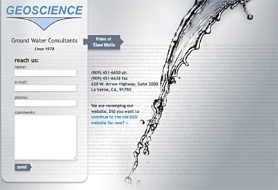
…A classy one-page (like this one) that has—at the very least—your address, phone number, and your logo.
 Instead of disappointing people who visit your site but don’t find what they’re looking for, until you’re ready to go live, your unfinished site should serve as an upscale online business card that encourages them to reach out to you.
Beyond that, set yourself up for success by doing the same two essential things on a one-page site that you’d need to do to have a successful 100-page site.
1.) Give people a reason to trust you by emphasizing your legitimacy and presence in the “real world” (instead of just in cyberspace). This may mean:
- adding pictures of your building and/or employees,
- including a trust statement (i.e. “We are the most-trusted source for…”), and/or
- listing brands you’re associated with (via logos, names, and quotes).
2.) Visually communicate why someone should do business with you rather than with a competitor. Answer the customer’s “What’s in it for me?” question. This may mean:
- displaying short written testimonials,
- explain the benefit of choosing you through attractive images, and/or
- a short commercial or a video of whatever you or your product is best at.
(For a great overview of the 10 essential elements of a great landing page, check out Bryan Eisenberg’s post on the subject, titled "Anatomy Of A Landing Page: Design Elements Exposed.")
Even if you fully intend to update the site ASAP, remember that things can be done in phases. For instance, if you have a Spanish language audience, you don’t need to translate your entire site into Spanish right away. You should, however, have at least one page that lets them know who to contact for Spanish language assistance or information.
Once you’ve uploaded your one-page design, show it to someone unfamiliar with what you do or what you want to sell. Then, ask them two questions:
- “Does my web page tell you what’s in it for you?”
- “If so, what do you think that is?”
(Afterward, be sure to let me know what they said by commenting below!)
